Currently, I am working on a long-form piece regarding the rising popularity of vintage sports apparel over the last few years. This week, I was tasked with creating short social posts to promote my piece, so I made graphics in Canva and used them in the posts. Here they are below.
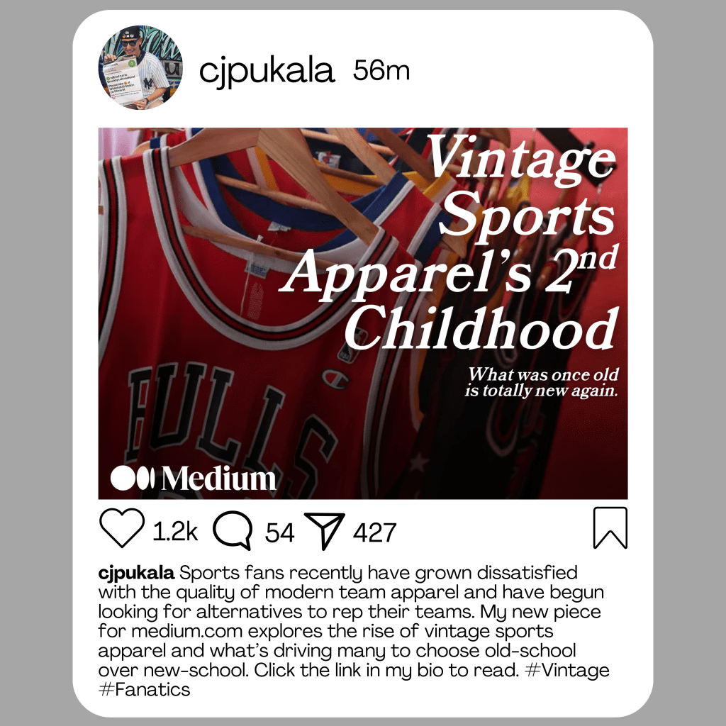
Instagram is more image-focused, so I decided to make the graphic the focus by including the title in big lettering. I did not want to do too much with it; if I included more wording, it would have been too cluttered and too much information for Instagram. Also, I made sure to fit my theme of putting song titles into the title of my article (2nd Childhood by Nas). I wanted to avoid coming up with a basic
X/Twitter
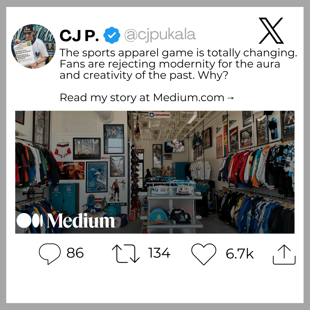
Once again, I avoided a graphic that could have been too confusing or too informative for a reader. I chose a simple image of a vintage sports apparel store because that is something I gravitate towards in my piece. I did not want to give away too much because that might make someone less likely to read the piece.
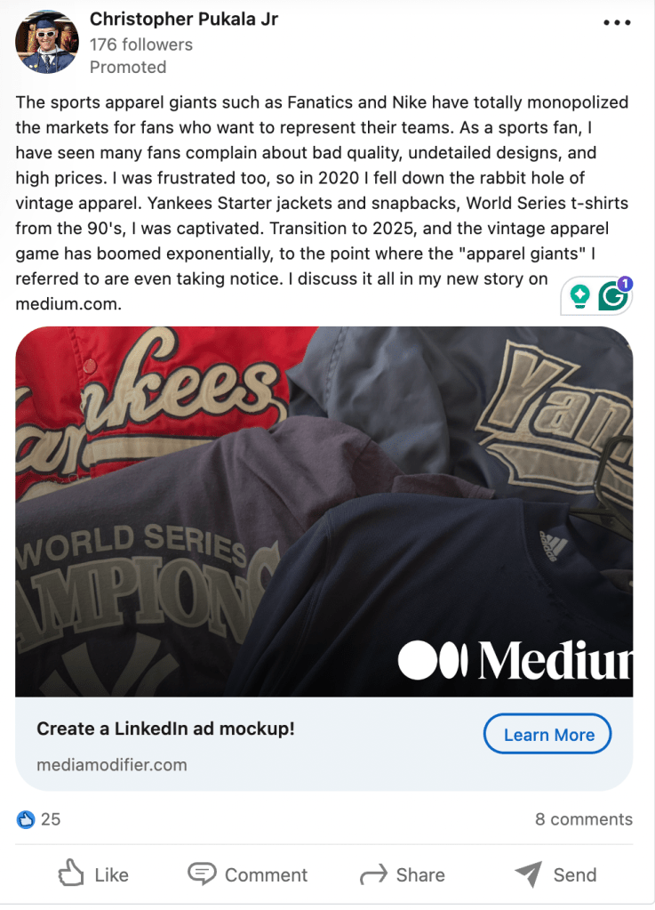
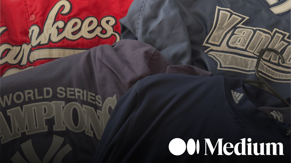
This is the most crucial post because LinkedIn is for professional contacts and for networking. I want to showcase my work in the most professional way possible on here, so I did some research into how others upload their work to LinkedIn. I’m giving a concise synopsis of what I am writing about and included a graphic featuring a photo I took of some vintage pieces from my personal collection.
I wanted to capture a reader’s attention because LinkedIn often features tons of information and visuals from all sorts of people, and sometimes people in my network may have gigantic networks themselves, so my post could get lost in the mix. I sometimes don’t even realize I need to try something that would make me stand out, and hopefully the visual gets people to stop scrolling.

Leave a comment